

A weak logo could cost you customers before you even meet them. And unfortunately, many businesses treat their logo as an afterthought that’s costing them precious business. But I can’t stress the importance of a well-designed logo enough. Your brand identity is the visual embodiment of your company’s personality, purpose, and value. A forgettable logo can make your business look unprofessional, blend in with your competitors, and fail to connect with your customers. That’s a lot of pressure to put on a mediocre logo, right? Instead of choosing a stock logo, you should craft a well-designed logo that communicates your company’s value. Are you ready to create a lasting connection and positive impression on your customers? Let’s dive into nine actionable tips for creating a logo that actually stands out.
Tip #1: Know Your Brand Like The Back of Your Hand
Before jumping into the design of your logo, it’s important to establish a clear understanding of your brand. Uncertainty of your brand leads to forgettable design. Build the foundation first. If you don’t know what you’re in the business of doing or why, neither will your customer. They’ll move on to a brand that speaks clearly to them. You must clarify your brand purpose, positioning, and personality before crafting a logo that resonates deeply. This initial work builds a strong foundation that will support your brand and make every design decision more meaningful.
Tip #2: Create Distinct Visuals
Generic clip art logos? Played-out typefaces? Ditch the predictable symbols and fonts and create something truly ownable. Now that you have a clear understanding of your strategy, the real work of brand identity begins. You don’t want to get lost in a sea of generic logos for your customer to find, so craft visuals rooted in your brand’s story and values. Conduct a thorough analysis of your market and understand how competitors in your industry present themselves. We create intentionally-designed visuals to differentiate your brand from competitors and strengthen recognition with your customers.
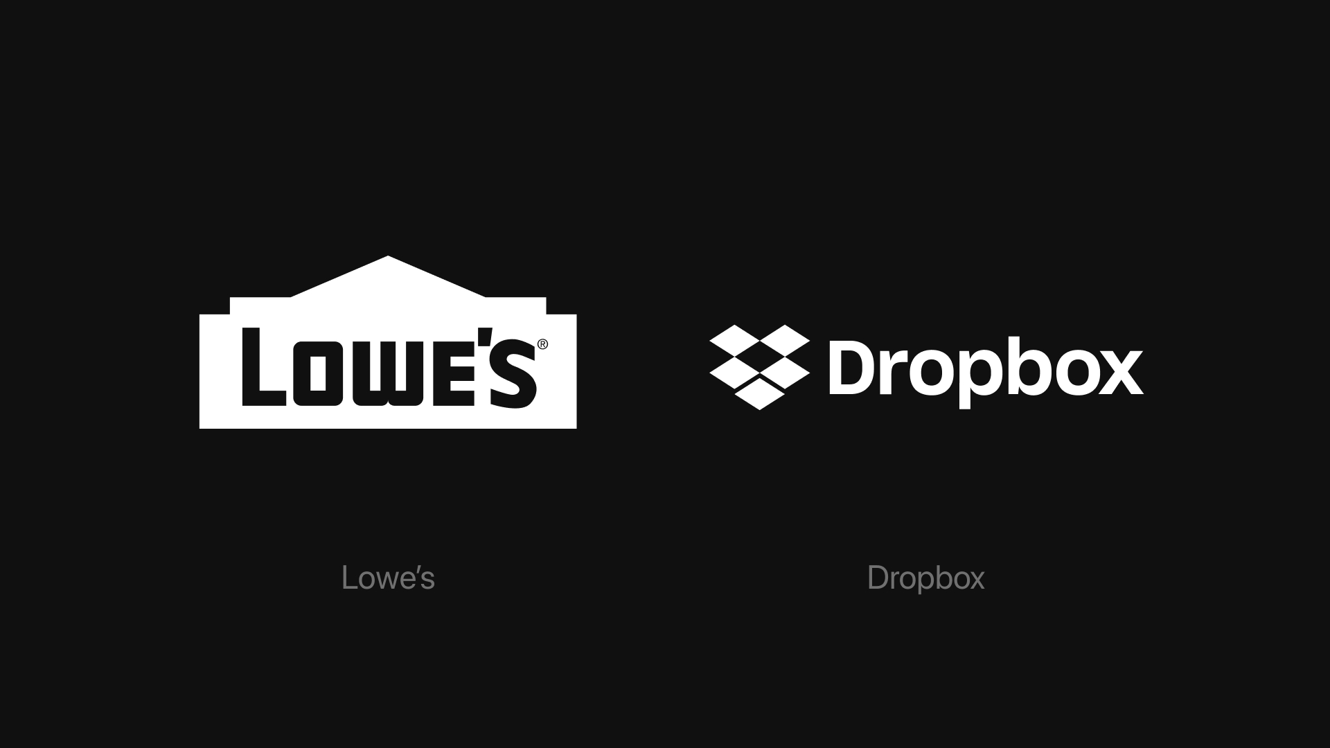
The examples below show the logos of Lowe’s, a US-based home improvement store, and Dropbox, a cloud storage provider. They use recognizable, but literal imagery to represent their product. While well-executed, these logos don’t feel entirely ownable and can easily get lost among their competitors offering the same goods or services.
Tip #3: Keep it Simple
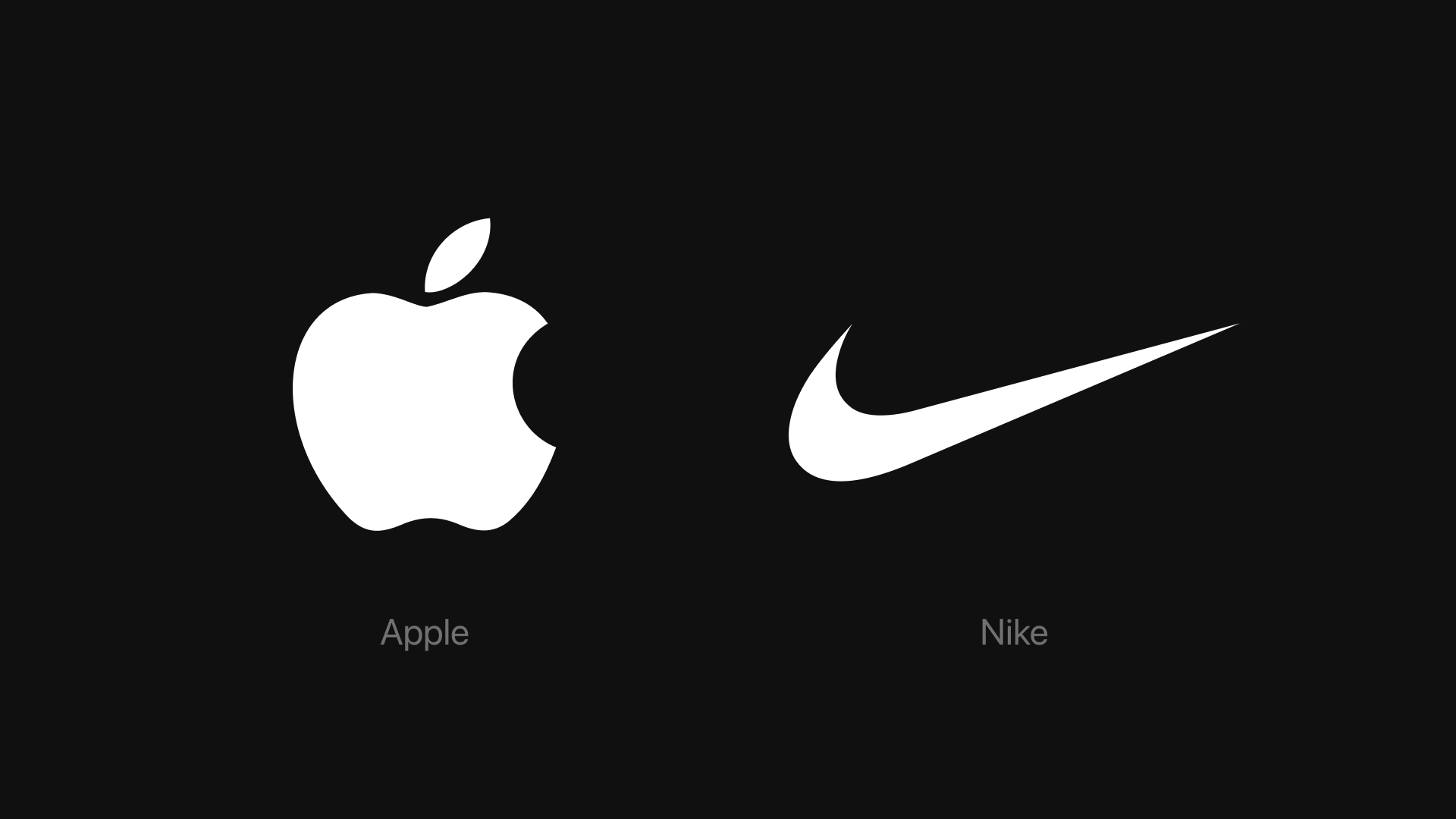
While beginning a logo design project can be exciting, exercising restraint is essential to a compelling visual identity. I understand the temptation to incorporate multiple eye-catching elements, but simplicity is the cornerstone of a lasting logo. Overcomplicating a logo with intricate illustrations or too many fonts decreases legibility and recognition. Aim for a mark that is as identifiable as it is memorable. Take brands like Apple or Nike – their logos are instantly recognizable, not because of their complexity, but because of their refined design. These logos communicate effectively without the need for excessive text, colors, or embellishments. Crafting a thoughtfully designed logo enhances brand recognition and makes your brand more memorable.
Tip #4: Choose the Right Typography
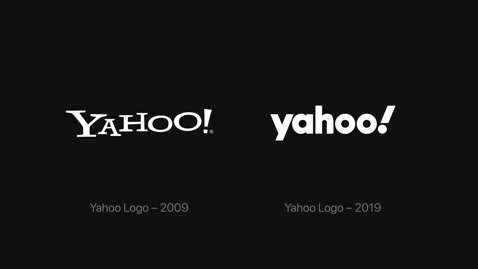
Carelessly chosen fonts can sabotage the potential for a good logo. That’s why a thoughtfully chosen typeface is a critical decision when designing a logo. Your logo should clearly communicate who you are through fonts that reflect your brand’s personality. Just like using intricate illustrations decreases legibility, using too many fonts or poorly paired fonts creates a subpar logo. Even something as simple as a font can make your brand feel outdated, unrefined, or untrustworthy. Take Yahoo!, for example. They only need one typeface and that font choice can completely alter the personality and perception of the brand. So remember: restraint is key. I like to stick to one or two typefaces to ensure clarity, build recognition, and reinforce distinction.
Tip #5: Select Colors Purposefully
Color has a greater impact on perception than we realize. Poorly paired colors or too many colors can diminish the readability or impact of your logo. Skillfully selected palettes can evoke certain emotions and associations. I use color theory and color psychology when building color palettes to influence positive associations like trustworthiness, optimism, or innovation. Curated hues evoke emotions and convey values that shape your customer’s perception of your brand. An intentional color palette enhances your brand’s visual appeal, reinforces brand identity, and influences how your audience perceives your business.
Tip #6: Choose Timeless Over Trendy
Have you ever looked at a piece of clothing or technology and knew exactly what decade it came from? When it comes to logos, timeless beats trendy. While exploring trends can be inspiring, your logo must reflect enduring aspects of your brand, not fleeting styles. Redesigning your logo should only occur when your brand’s positioning evolves, not when a new font or color palette is trending. By reinventing your logo every time a new design is in style you risk losing the equity and fanbase your brand has built. A logo rooted in strategy and simplicity builds deeper trust than any short-lived style.
Tip #7: Make it Versatile
In a fast-evolving world where marketing has gone increasingly digital it’s no excuse that your brand can’t keep up. These days, businesses need to take into consideration all of the platforms on which their brand can be discovered by customers. Adapting your logo for various platforms means having a versatile visual identity to fit any size and scale. Your logo must be flexible to meet the demands of different touchpoints that may require a horizontal, vertical, or icon version of your logo. Take Airbnb for instance: their logo works in various lockups and allows for applications across different mediums. A full version of their logo may suit a billboard while an icon works better in a social media photo. If your brand lacks adaptability where necessary it may appear unprofessional or inconsistent. Working with a designer to create a cohesive and adaptable suite of logo variations will ensure that you can build brand awareness at any scale.
![]()
Tip #8: Test It On Your Audience
At this point you may have a beautifully crafted logo, but does it actually appeal to your target audience? There’s nothing worse than crafting a logo that doesn’t deliver. When you’ve completed your logo design it’s time to validate it by showing it to your stakeholders. After all, you designed it with them in mind! Gather feedback from your team and target audience to see how they respond to the new mark. Does the design reflect your brand’s values? Is it easy to understand at a glance? Does it leave the right impression?
Conduct internal reviews with key stakeholders and consider testing it with your ideal customers. A/B testing logo options can provide valuable insight into what visuals connect best with your audience. Maybe the color palette is giving off the wrong vibe or the typography doesn’t match your brand personality. These steps ensure your logo performs well in the real world, not just on a mockup. The main goal of your logo is to reinforce your brand message and build stronger connections with your audience, so how does this new logo measure up?
Tip #9: Create An Entire System
You can’t just slap a new logo onto old collateral, so don’t force it into outdated templates. Your brand is so much more than your logo. It is but one piece of your brand identity that encompasses the full experience of your business: how it looks, feels, communicates, and connects. Without an established system, your brand can become disjointed and messy. This ultimately dilutes the impact of your message, confuses your customers, and makes your brand feel less trustworthy.
So don’t stop with your mark, flesh out the whole system. Using your logo as the foundation for your brand identity, implement consistent use of brand typography, color palette, and iconography across touchpoints. Consistency advances recognition and unifies your content on all platforms. Building a strong brand ecosystem transforms a single logo into a toolkit that supports everything your business does. Once you have this system in place, designing assets becomes easier and your customers begin to recognize your brand because you have shown up consistently.
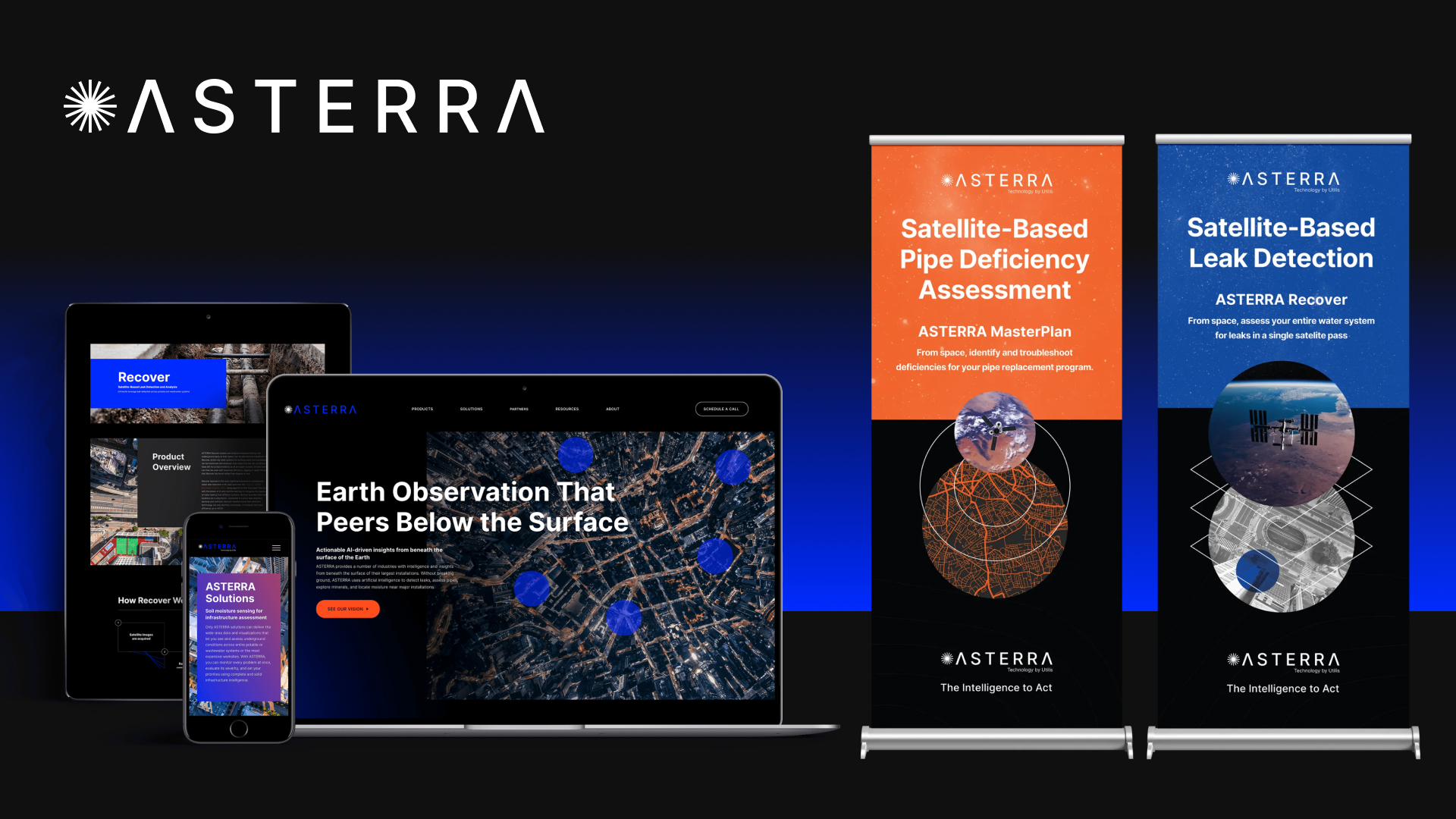
For example, take a look at the branding we built for our client ASTERRA. They sought to establish a distinct identity that reflected their mission and positioned them as a leader in the market. From a new name to a compelling brand identity, VSSL brought ASTERRA’s vision to life across their website, software, and print collateral. It all started with the brand strategy and logo, and from there, we fleshed out their design system to become a flexible suite of assets that cohesively communicate their brand.
Let Us Help You Create a Memorable Logo
Crafting a memorable logo requires more than just good design – it demands intention, clarity, and a deep understanding of your brand. From defining your strategy and creating distinct visuals, to choosing the right typography and ensuring flexibility, each element plays a vital role. Prioritize timeless design, test your ideas with your audience, and build a cohesive system that reinforces your brand across every platform. Use these nine tips as a checklist to guide your process and elevate your visual identity. Whether you’re building a brand from the ground up or refining your existing identity, keep your customers at the forefront and aim for a logo that’s impactful and enduring.
Ready to dive into your brand? The VSSL crew can help! At VSSL, we’ve helped companies of all sizes establish strategic brands that go beyond just a logo. Reach out today if you want to learn more about our services and process.