
Choosing the right typography means picking fonts that reflect your brand’s personality while staying readable across all platforms. The right typeface helps create a cohesive, professional look that strengthens brand recognition.
Here at VSSL, we are strong proponents of the Brand-First methodology. From your logo to your color palette, each component of a brand plays a crucial role in shaping how your audience perceives your brand. One often underestimated, yet incredibly powerful aspect of branding is typography. Choosing the right fonts, styles, and type treatments, and using them consistently, can help convey your brand’s personality and message, foster recognition among consumers, and differentiate your company from other competitors in the market.
So how do you know what typography is right for your brand? To answer that question, you must first understand the basics of typography.
Typography Basics
What is Typography
First off: what is typography? Typography is the art of arranging letters and type so that they are legible and visually appealing. It involves selecting elements such as typefaces, fonts, styles, spacing, and layout to communicate a message effectively. The term typography encompasses both the technical and aesthetic aspects of how type is used, both of which are important when considering brand typography.
Typeface vs. Font
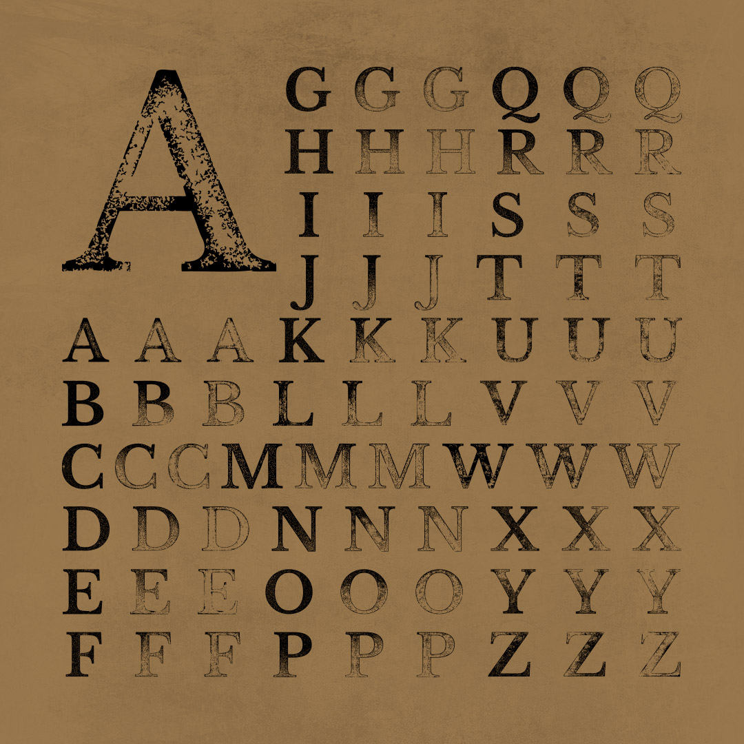
Many people believe that typeface and font are interchangeable terms, but there is an important distinction. A typeface is a set of one or more fonts that share a similar design. Fonts refer to the specific variations within a typeface or family, such as regular, bold, italic, etc. For example, Helvetica is a typeface. But Helvetica Light, Helvetica Bold, and Helvetica Black Condensed are all fonts.
Typeface Categories
There are five main categories of type: serif, sans serif, script, monospace, and display. All convey a different feeling and personality, so understanding the differences is imperative to selecting them for your brand.
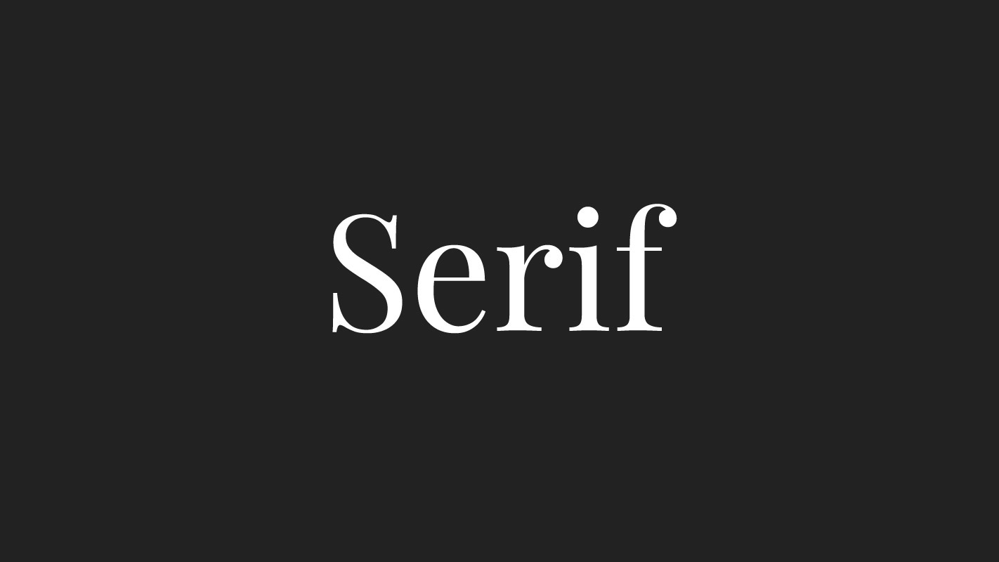
- Serif typefaces are characterized by small lines or “feet” attached to the ends of the main strokes of the letters, called serifs. These typefaces are most often associated with tradition, formality, and reliability. They are commonly used for body text in print materials, as the serifs help guide readers’ eyes along the text.
- Sans-serif typefaces lack serifs, resulting in cleaner and more modern letterforms. These typefaces are often associated with simplicity, minimalism, and clarity. They are commonly used in digital spaces, signage and display materials.

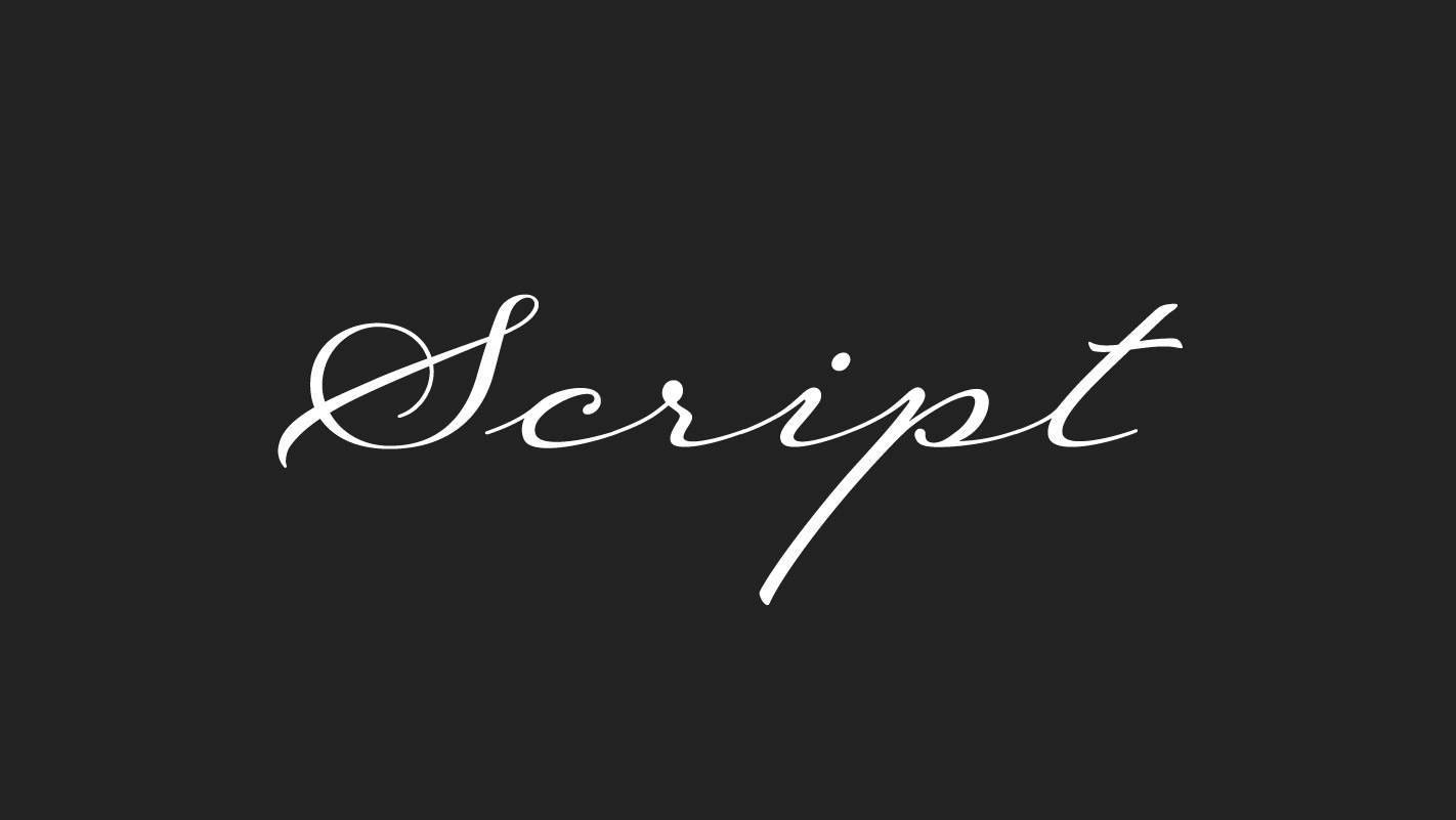
- Script typefaces mimic handwriting and calligraphy, with flowing and decorative letterforms. These typefaces are commonly used for formal invitations, greeting cards, or materials needing a personal or artistic touch
- Monospace typefaces have equal spacing between each character, regardless of the width of the letterforms. These typefaces are commonly used in typewriters and computer programming.

- Display typefaces are designed for use at larger sizes. Many display typefaces could also be categorized as serif, sans-serif, or even script. The difference is that they often feature exaggerated proportions, intricate details, and unique designs for maximum visual impact. Display typefaces are commonly used for headlines, logos, and posters.

Choosing the Right Typography for Your Brand
So now that you have an understanding of typography, how do you choose the right type for your brand? Below are some steps to take and things to consider.
Consider Your Brand’s Identity and Tone of Voice
Consider the mood and personality you want to convey through your brand – take into account your target audience, industry, and unique selling points. Your typography should align with these traits to create a cohesive brand image. By defining your brand identity upfront, you’ll have a solid foundation for selecting typography that resonates with your audience. For example, serif fonts often exude a sense of tradition and authority, making them suitable for more formal brands, while sans-serif fonts are often perceived as modern and minimalist, ideal for contemporary brands.
Avoid Overused or Poorly Designed Typefaces
When considering typography for your brand, it’s crucial to avoid overused or poorly designed typefaces to maintain brand distinctiveness and credibility. Overused typefaces, such as Times New Roman or Impact, can dilute the uniqueness of your brand and lead to associations with amateurism or lack of originality. Similarly, poorly designed typefaces, such as Comic Sans or Papyrus, may lack the refinement and professionalism necessary to convey your brand’s values effectively. By selecting typefaces that are both distinctive and well-crafted, you can ensure that your brand typography communicates a sense of quality and credibility to your audience. Monotype, MyFonts, Google Fonts, and Adobe Fonts are all great resources for finding professional and well-designed typefaces for your brand.
Choose Multiple Typefaces to Create a Robust Visual Identity
Pairing type is another thing to consider when choosing brand typography. A great rule of thumb is to choose around two to three typefaces – more than four will create visual clutter and can detract from the overall readability and brand message. When pairing typefaces, ensure they complement each other and maintain harmony while providing contrast. For example, pairing a bold sans-serif headline with a lighter serif body font can create a balanced and dynamic composition. Experiment with different combinations to find the right balance for your brand.


Establish Hierarchy Through Size, Weight, and Style
Hierarchy within typography is important because it helps guide the reader’s eye and prioritize information. With your two to three brand typefaces, use variations in size, weight, and even capitalization to create clear visual contrast between different levels of information. Consider the hierarchy of your content and choose styles that differentiate between headlines, subheadings, body text, and other elements.

Consider Readability and Legibility
While it’s tempting to go overboard with trendy fonts and or elaborate styling, readability and legibility should always be top priority. Your audience should be able to effortlessly read and understand your brand’s messaging without any distractions. Avoid overly decorative typefaces or excessively styling your type. Maintaining a balance between clarity and flair is important to ensure that your typography effectively communicates your brand message.
Conclusion
Choosing the right typography for your brand is a strategic decision that requires careful consideration of your brand identity and tone of voice. By understanding the fundamentals of typography and its impact on brand perception, you can effectively communicate your brand’s identity and connect with your audience on a deeper level. Experiment with different typefaces, styles, and pairings to find the perfect combination that resonates with your brand and differentiates you from competitors. Remember, typography is not just about letters on a page; it’s about creating a brand experience for your audience that leaves a lasting impression.